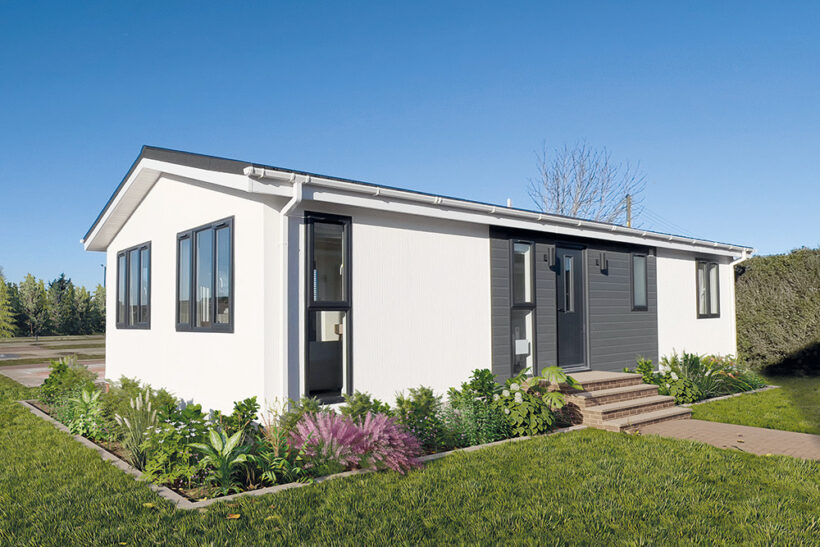
After watching Harbur set up their manufacturing business in 2022, it’s exciting to start seeing their models built and out on parks ready to report on. First up is the H4 residential home, which we can see here as a 40’ x 20’ ft model, personalized with a few tweaks by Wyldcrest Parks and now for sale at Rookery Park Drive park in Bury St Edmunds, Suffolk. At the time of going to press, Harbur were busy building their fourth home for Wyldecrest, with great positive feedback after the first was delivered.
CUSTOMISATION
This smart new park home boasts a modern interior design customised to also offer a traditional feel. Working from the core H4 preset plan, two French doors were replaced with windows, and the kitchen was separated from the lounge and dining area to add a traditional element to the original open plan version.
SPECIFICATION AND LAYOUT
As mentioned, the home shown here is 40’ x 20’ but we think it feels much bigger thanks to the design. The living area comprises of an L shaped living/dining area, with a separate kitchen leading to the rear door. Then there’s a family bathroom, two double bedrooms, and a large master bedroom suite with en-suite shower room. There’s a large cloaks cupboard in the front hall, with sliding doors to make access easy, and coat hooks and a shoe rack at the ready within.
DESIGN AND BUILD
Harbur has a ‘greener by design’ mantra, so sustainability and energy efficiency through design are key objectives for them. No surprise, then, that they build using the SIP (structural insulated panel) construction method, which is said to deliver superior insulation and lower energy bills. The homes also have an architectural design feel, again unsurprisingly given Harbur’s original core business in architectural design for bricks and mortar as well as park and leisure home design. Homes are covered by 1-year manufacturing warranty, and Platinum Seal Warranty Scheme, the longest running ‘insured’ structural warranty scheme in the park and leisure home sector, offering protection against structural defects.
EXTERNAL APPOINTMENT
This H4 has a white render contrasted by beautiful, modern black windows and sliders to give the home a contemporary feel, but with traditional park home roof tiles in keeping with the destination park environment. The windows are in recycled, black frames, and the front door is anthracite composite with strip window which lets light into the entrance hall. The door is lit with external up and down lights and sits within an external cladding section, contrasting well with the render and adding focus and form to this area.
INTERNAL APPOINTMENT
This home has a slick, clean feel, with smooth plaster walls and ceilings throughout, vaulted ceilings, trim coving, extra wide internal doors and brushed stainless sockets and switches throughout. That architectural approach has given it a clean and uncluttered look, probably aided by the oak-effect laminate flooring and subtle furniture and window dressing choices.
KITCHEN
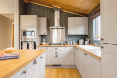
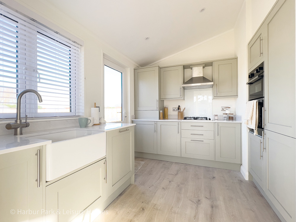
The kitchen is as easy on the eye as it is practical, with contemporary units and handles and a light and bright feel. The Belfast sink draws the eye immediately, with mirostone worktops adding further to the quality feel. There’s also an instant three in one hot/cold water tap, so this home comes with all mod cons. There’s a built-in double eye level oven, a four burner gas hob with extractor above, and an integrated fridge/freezer and dishwasher and washing machine. There’s a splash-panel behind the hob, with low-level splashbacks elsewhere. The wood effect flooring adds warmth and the recessed spot lighting keeps the ceiling clean. The venetian blind finishes the picture picking up on the white in the Belfast sink and worktops further.
LOUNGE/DINER
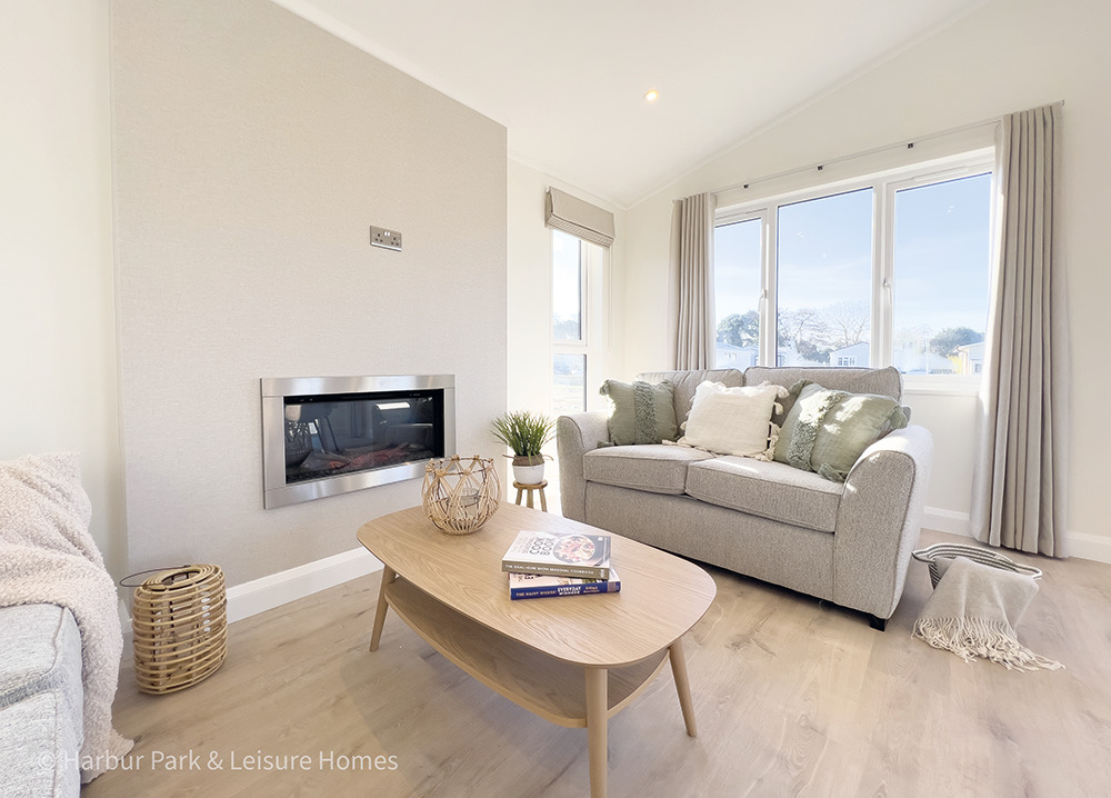
The first thing you notice in the lounge/diner is the feeling of space and light. The space would allow for flexibility in terms of where you place the furniture and here it’s shown with two sofas facing each other, which we think is beautifully symmetrical. It also plays to the main focal point, a feature TV wall, papered elegantly and with a raised, inset electric fireplace. Above is a natural spot for the TV, which would also be visible from the dining table and four chairs here.
The furniture has been carefully chosen for style and comfort; the sofas look substantial and the coffee and console tables are elegantly modern. The suede effect, padded dining chairs are supportive and stylish, adding contrasting texture to the mix. There are triple-aspect windows to this lounge/diner, letting light flood in from all sides, and they are dressed neatly with full-length curtains to the main windows, with Roman blinds to the smaller side windows. As mentioned previously, the H4 has two sets of French doors on the preset original where this version has two sets of half-height windows instead. A lovely touch in this model is the designer radiator near the dining area, adding to the visual appeal of this space in a crisp white.
BEDROOMS
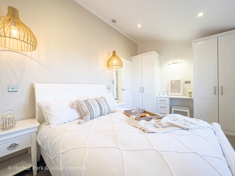
It’s great when a manufacturer goes for a completely fresh feel in places and the bedrooms are probably where you notice that most in this model. The second double bedroom has two double fitted wardrobes in offering an impressive amount of storage, and the matching curved bed frame with side tables are in white, continuing the design theme well. Feature wallpaper puts an appearance on the wall behind the headboard, framing the bed perfectly in a complementary tone. We love the stylish wooden pendant lights over each bedside table, adding curvature and interest as they cast light over the wall. The master bedroom feels wonderfully spacious, with two double wardrobes bridged by a dressing table with stool, lit from above by a fixed downlighter. The feature wall and lighting repeats here, and after walking past the bed you’re into the en-suite shower room.
BATHROOMS
This model benefits from a family bathroom and the en-suite shower room to the master bedroom. Slick and modern, it has plenty of character, delivered in such a way that traditionalists will love just as much as fans of contemporary design, as the scheme blends the two styles seamlessly. Oak vanity units and mirrors have black trim, and high-quality wall and floor tiles are carefully placed to make the most of the space visually. We love the luxurious tiles around the bath and in the shower as they add a rustic feel, warmth, and the highly desirable texture to offer a bit of resistance if you need to place your hand on them to steady yourself. The en-suite has both a rainfall shower and handheld attachment, and a heated chrome towel rail will keep towels ready for when they are needed. There’s even more luxury built into the bathroom in the form of illuminated mirrors and a Bluetooth speaker, so occupants of this lovely home can sing in the bath to their heart’s content!
ABOUT HARBUR
Harbur already has the credentials of an established design business, having worked with multiple manufacturers for many years creating a range of innovative and exciting park and leisure home designs. So, we have no concerns about their credibility and ability to produce a great home with their high level of industry expertise, and were safe in our prediction that they would be building to exacting standards.
OUR VERDICT
Wow. We’re happy to see that this looks and feels different from the norm, while having enough familiarity to make it feel like an easy choice. This is a soothing, clean design, with modernity yet also playing to the traditional layout in this version, so we think it will tick a lot of boxes for many buyers. There’s a great level of luxury built in, but not in places where that’s wasted, so this has been well thought through. Most memorable is the feeling of light and space throughout. The décor is such that it will have wide appeal as it screams quality without being ostentatious; this is a home with substance, style, and serious appeal!

