Bella Brodie explores the 2023 version of Omar’s style icon of a residential home…
When it was first introduced, the thinking behind the Ikon was that it should lead the field in the style stakes; constantly pushing forward with stand-out visuals combined with a practical layout and specification for luxurious residential living.
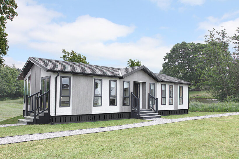
That’s not changed, and it’s probably the driver behind it being one of the most regularly updated models in Omar’s portfolio to keep it bang-up-to-date. It’s now been refreshed by the Group’s talented design team, who clearly enjoyed the challenge, with great results. The model shown here was showcased at the Stoneleigh, World of Park & Leisure Homes Show, and was built to a 45ft x 20 footprint, although a variety of sizes are available from 40ft x 20 through to 65ft x 22.

IMPRESSIVE LAYOUT
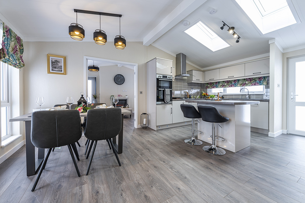
The Ikon has an open plan mid-section, with the entrance into a large kitchen/diner and the back door opposite. This arrangement lends itself to a well-fitted kitchen with plenty of storage, an island breakfast bar and workspace, and a chic dining space opposite. The lounge runs across the width of the home creating a light, airy and contemporary living space with plenty of light and appeal. To the rear of the home, there’s a small hallway leading to the family bathroom, second bedroom and master suite, which has an en suite shower room. If you take a look at the floor plan it shows how little space is wasted with this layout, and that’s one of the reasons it always feels spacious in any footprint.

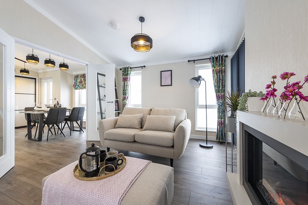
The new design theme has given the Ikon a really fresh feel, so although it has all the familiarity of that great layout, you would hardly recognise the décor, which ramps up the level of sophistication visually. Floral fabrics have added impact, but in a way that isn’t overwhelming as they are paired with plain blinds in places, and the black has been used as an anchor colour, adding a hint of the Orient, delivered in a contemporary way. There are soothing, natural tones in the flooring and worksurfaces, and they are lifted by the cream and white in the doors, walls and ceiling. Two large Velux windows in the kitchen add an architectural feel, and wherever you look in the Ikon, it feels uplifting.
OUR VERDICT
This new version of the Ikon is far more exciting than previous incarnations, offering something completely different to buyers. The combination of bold fabrics and contemporary colour scheme with black trim may not appeal to absolutely everybody, but it’s so striking that it’ll probably appeal to most far more than some of the ‘safer’ schemes, so it should perform well from a sales perspective on parks. It feels spacious and uplifting and has plenty of storage, and it’s exactly the kind of home that helps dispels myths about park homes. For those thinking of making that leap away from a brick-built property to a park home, the Ikon is modern, it will cope well with family life, and it uses every inch of space brilliantly. While this was quite a surprise to walk into as previous updates had been mild in comparison, the Ikon has now been appropriately dressed to lead in the fashion stakes again. It’s stunning!


