Bella Brodie reviews the Kingswood, Willerby’s latest bespoke residential park home…
Willerby’s park homes sit within the company’s bespoke range, and when we noticed that the range had expanded from three to four, we decided to take a tour of the new addition to find out more.
The Kingswood is an interesting model, because it combines Willerby’s own style with a fairly traditional layout, yet it has a few features that give it particular appeal within the accessibly priced residential genre.
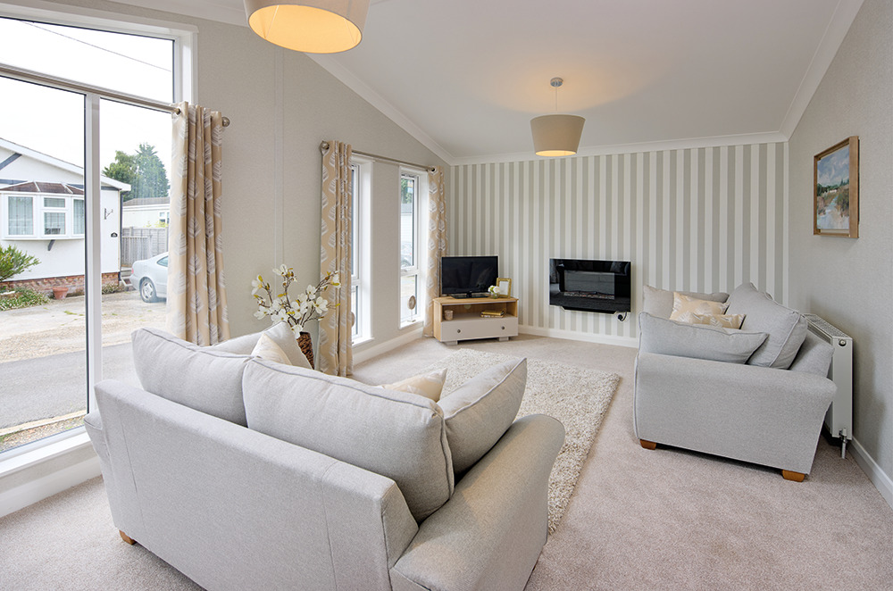
We love the feature wall in the lounge of the Willerby Kingswood, which makes a real impact!
ACCOMMODATION AND LAYOUT
The model shown here is a 36ft x 20 two-bedroom model, although the Willerby Kingswood is also available in a 40ft x 20 footprint, which adds a bit more space to the living area. An entrance lobby leads to the kitchen/diner with an opening to the kitchen opposite, then it continues as an open space through to the bedrooms and bathrooms.
EXTERNAL SPECIFICATION
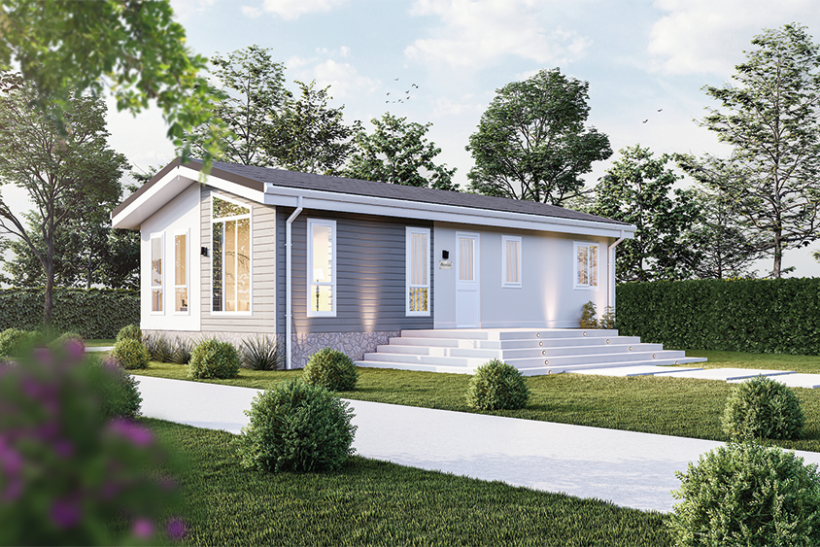
The Kingswood is a chic residential home, with long, strip windows to the front, and an extra panel above one set in the lounge. A section is clad in Timberwolf CanExel and that gives it a wonderfully modern feel, worthy of placement on any park, and with enough kerb appeal to act as a show home, too. An external tap and powerpoint will make gardening easy.
INTERNAL APPOINTMENT
The lounge/diner and kitchen in the Kingswood are vaulted, making it feel spacious and light. The lounge area is clearly defined by carpeting, switching to parquet-style linoleum in the halls, kitchen and bathrooms, so this will be easy to keep clean, yet it has balance in the colouring and design too. Panelled white doors are painted white, and the feel throughout is uplifting, yet warm and homely. While the layout is fairly traditional, the décor is a harmonious combination of traditional and contemporary, with striking feature walls and light colours in the soft furnishings to match.
LOUNGE/DINER
The open-plan living/dining area of the Kingswood makes entertaining easy, offering a social space that’s perfect for hosting guests as it feels spacious even in the 36ft x 20 size. The table accommodates four, and no doubt a six-seater would also sit perfectly well in a
40ft x 20. The extra window into the apex of the roof at the front adds an architectural feel to the lounge area, which is furnished with two sofas and a corner TV unit, while striped wallpaper offers a characterful backdrop. The full-length leaf print curtains are in a lovely shade here, although other options are no doubt available. As you would expect in a Willerby home, there are plenty of power points in this space – an element always worth watching out for!
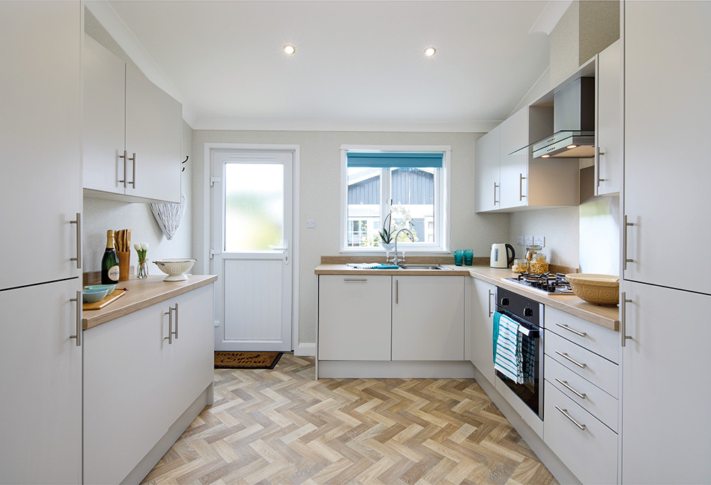
A symmetrical start to the kitchen, with space for all mod cons
KIITCHEN
Fitted with a Magnet kitchen as standard, this light and bright space is perfect for cooking, baking, and getting creative in the kitchen. Full-height units on either side offer a symmetrical kickstart; one housing a built-in fridge-freezer. There’s useful work surface space beyond these, and Willerby has packed in quite a few units. An oven is well-equipped with a four-burner hob and extractor above, and there’s a large stainless steel splashback behind this, bouncing light back in. It would also, no doubt, be easy to keep clean. A mixer tap sits over the stainless steel sink, matching the stove area and handles on cupboards, and there’s a slimline dishwasher to offer a helping hand on busy days. A blue rollerblind here offers a spark of continuation with the bedrooms, and the back door has country-style panelling in the lower half. The overall effect is as characterful as it is practical, so this is well thought through on every level.
BEDROOMS
Straight ahead within the inner hall is the second bedroom – in this case, furnished with a double bed, large wardrobe, wall mirror and side tables. A large headboard looks grand against a chic, papered feature wall, and the stylish tie-in with the curtains here is exquisite. Although the room is simple and straightforward, it has great warmth and quality within. Opposite the bed is a raised TV and power point, perfectly positioned for watching TV in bed.
The master suite matches from a design perspective but has space for a dressing area comprising of dressing table and stool, four double wardrobe with drawers and mirror leading to the en-suite shower room. The family bathroom matches, with tiling around the bath edged neatly with stainless steel trim.
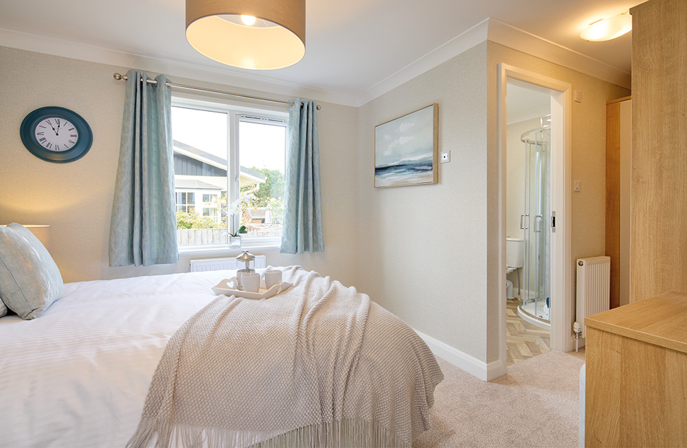
The master suite has gorgeous styling
BATHROOMS
The Kingswood offers the best of both worlds, with a family bathroom and en suite shower room covering both preferences. The en suite shower room is equipped with corner shower unit, WC and wash handbasin with mirror over. The rollerblind offers a solid block in keeping with the feature wall in the bedroom; just a shade deeper for contrast.
OUR VERDICT
The Kingswood is light, bright, pretty and practical, and the combination of traditional layout with contemporary features works brilliantly. This would be a great starting point for any residential buyer, specifying either way according to budget and taste, and including a few key design points that add both interest and character. Those who are worried about condensing their wardrobe ahead of moving to a park home would love the storage and dressing area in the master suite. The colour scheme is simple and classy, and should have mass appeal to buyers. Overall, it’s great to see another home in Willerby’s residential range. While this is a little more mainstream than the other models, it’s got plenty of appeal, and it still feels like a Willerby home, through and through.

